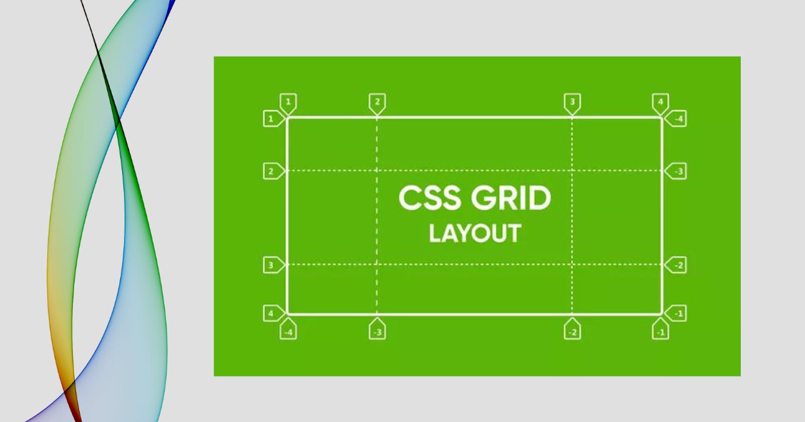
Learn CSS Grid Layout
This post will go through CSS-Grid attributes and the utility they give. We'll also discuss how it differs from the flex property.


What is CSS Grid Layout
CSS Grid helps make simple and complex layouts where the items in the grid container are arranged in two dimensions both horizontally and vertically. Grid is used to arrange the HTML elements in the desired layout. We can arrange the elements in the columns and rows as we wanted. In CSS flexbox we can only arrange the items in the one-dimensional format we don't have much control over the rows and columns it is difficult to align them using the flexbox. hence we want to achieve this by CSS grid.
A grid container and grid items
When we use the display property with the value grid to specify any element as a grid container, the components contained within become grid items. It can frequently represent a header, sidebar, footer, or another comparable layout component in our design.
.grid-container {
  display: grid;
}
The grid value displays the selected container as a block-level grid.
Grid Container Properties
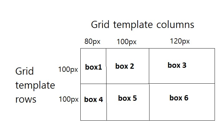
Grid-Template-Column & Grid-Template-Row
Grid-Template-Column is used to define the number and width of columns. Grid-Template-Row is to define the number and height of rows.
Syntax:
.grid-container{
  grid-template-columns : 80px 100px 120px;
  grid-template-rows : 100px 100px;
}
Output:
.grid-container{
  grid-template-columns : 1fr 1fr 1fr ;
  grid-template-rows : 1fr 1fr;
          // OR
  grid-template-columns : repeat(3, 1fr) ;
  grid-template-rows : repeat(2, 1fr) ;
}
Output:
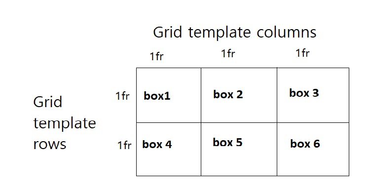
In Above Example, we have used fr unit in the values. Fr stands for a fractional unit and 1fr means one part of the available space in the grid container. It serves the distribution purpose of the space. Instead of '1fr 1fr 1fr' for 3 columns/rows, we can use the repeat() notation if they're all going to be of one size.
Row-Gap & Column-Gap
It defines the size of the grid lines. The default value is 0. Row-gap specifies the gap between rows and column-gap specifies the gap between columns.
Syntax:
.grid-container{
  display: grid;
  grid-template-columns : repeat(3, 1fr) ;
  grid-template-rows : repeat(3, 1fr) ;
  row-gap: 20px;
  column-gap: 5px;
}
Output:
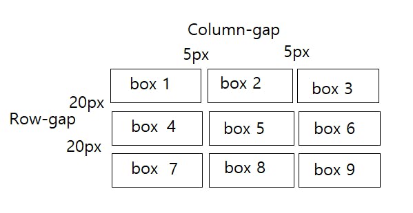
From the above image, we can see that a gap of 5px was set for the columns and 20px for the rows of the grid container making them equally spaced.
Justify-Content property
The justify-content property distributes space between grid items along the row axis, horizontally in a grid container.
Syntax:
.grid-container {
   justify-content: start | end | center | space-between | space-around | space-evenly;
  }
Align-Content property
The align-content property distributes space between grid items along the column axis, vertically in a grid container.
Syntax:
.grid-container {
   align-content: stretch | flex-start | flex-end | center | stretch | space-around | space-between;
   }
Grid Item Properties
Grid-Column property
grid-column-start is the grid line from where the grid item starts and grid-column-end is the grid line where the grid item ends. The grid item grows horizontally.
Syntax:
grid-column: grid-column-start / grid-column-end;
.item{
  grid-column: 1/4;
        OR
  grid-column-start:1;
  grid-column-end:4;
}
Grid-Row property
grid-row-start and grid-row-end are the grid lines from where the grid item starts and ends vertically.
Syntax:
grid-row: grid-row-start / grid-row-end;
.item
{
  grid-row: 2/4;
        OR
  grid-row-start:2;
  grid-row-end:4;
}
Justify-self property
It aligns the position of the selected grid item along its cell's row (inline) axis.
Syntax:
justify-self: start/center/end/stretch;
.item{
  grid-row: 2/4;
  justify-self: center;
}
Align-Self property
It aligns the grid item in a cell along the column axis or vertically.
Syntax:
align-self: start/center/end/stretch;
.item{
    align-self: center;
}
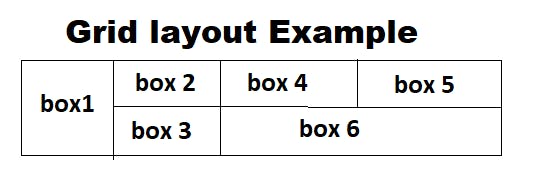
Grid-Area property
We specify some name with this property and then we can use these names to make a grid template using grid-template-areas property.
The grid-area property is also used to assign a name to a grid item. which can be used in a grid-template-area property of a container. We can practically see where our layout components like Header, Sidebar, Main Content & Footer are in the entire layout of our webpage.
.grid-item {
  grid-area: grid-row-start / grid-column-start / grid-row-end / grid-column-end;
}
.one {
  grid-area: 1 / 1 / 1 / span 3;
}
Grid-Template-Area property & Grid-Area property
/* Keyword value */
grid-template-areas: none;

/* <string> values */
grid-template-areas: "a b";
grid-template-areas:
  "a b b"
  "a c d";

/* Global values */
grid-template-areas: inherit;
grid-template-areas: initial;
grid-template-areas: revert;
grid-template-areas: revert-layer;
grid-template-areas: unset;
The grid-template-area property specifies the area where we want to place named grid items within a grid container.
Example
grid-template-areas:
    "header header header"
    "sidebar main main"
    "sidebar main main"
    "footer footer footer";

    .header{
  grid-area: header;
}

.sidebar{
  grid-area: sidebar;
}

.maincontent{
  grid-area: main;
}

.footer{
  grid-area: footer;
}
Summary
We learn css grid all property what is syntax example with output.
We almost covered important property of grid container and grid items.
I hove you understood all of property.
- if you want more practise play grid garden game. click on this GRID GARDEN game link.